Supporting families and the elderly in their care journey.
Churches of Christ
Introduction
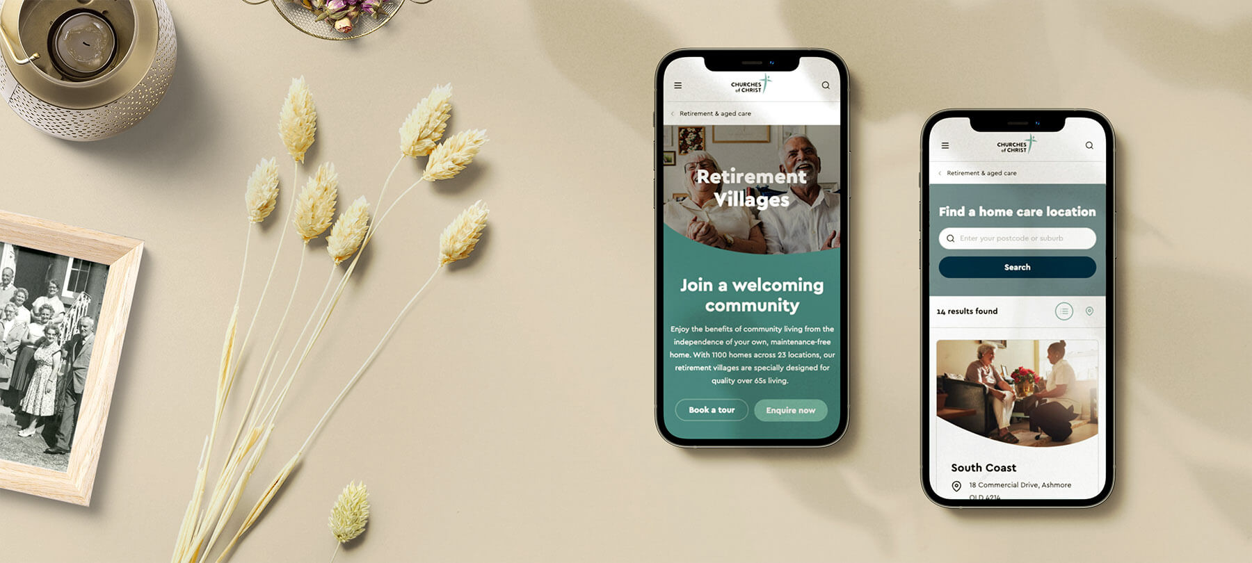
Churches of Christ in Queensland is a not-for-profit provider offering a range of care services, from retirement living and aged care, to foster care and social housing.
As part of a major rebrand, they wanted a new website that would better reflect their values and help their wide range of customers in their specific care journeys, addressing key pain points along the way.
I was part of a team at digital agency Luminary delivering this new website, which was launched in May 2022. My role consisted in leading the user research activities to map the personas and customer journeys, as well as the user experience by working on the information architecture and wireframes.
My role
User research
Information architecture
Wireframing & prototyping
User testing
The research process
A key goal was to deeply understand the customer journey for key segments of the website and define the pain points that the online experience would have to address. As Churches of Christ has a wide range of audiences, I ran a workshop to prioritise the customer segments that were most important to target on the website and in the user research. I then conducted 23 interviews across retirement living, home care, residential aged care, foster care, and philanthropy which helped us develop 8 sets of detailed personas and customer journeys.
Competitor analysis
Persona prioritisation workshop
23 customer interviews
8 personas
8 customer journeys
Insights report
Research snapshots
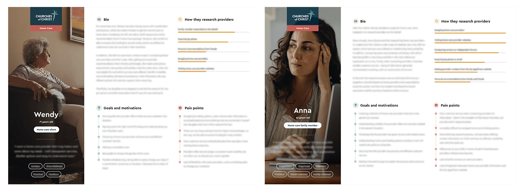
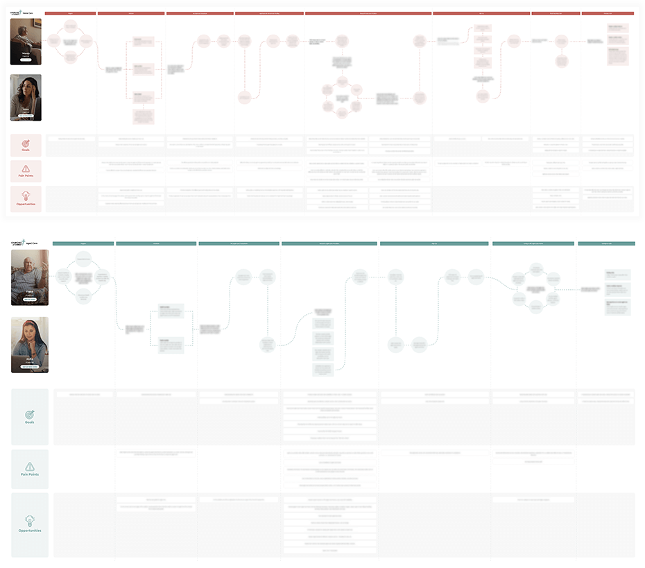
Condensing the findings
In the research we uncovered dozens of detailed pain points, focusing particularly on aged care as the highest priority from a business point of view. Here is a very high-level summary of some of the pain points that were uncovered.
Key pain points for aged care
1. It is difficult to compare retirement living, home care, and residential aged care options.
2. The home care application process is overwhelming, with convoluted processes and funding options, unclear explanation of fees and costs by providers, and long waiting times to apply for home care packages.
3. Comparing aged care facilities can be difficult, as online information offered by providers can sometimes be vague or misleading, and there is a lack of transparency about availability in aged care homes.
Key pain points for other audiences
1. Foster carers, youth, and families who need support are often unaware of key services, resources and emergency support numbers.
2. Donors and philanthropists find that online donation forms are limited, with no options to give one-off gifts and lack of control over which specific causes the money should go to.
Mapping the structure
After brainstorming ideas with the team that would address the pain points uncovered in the research, I created a list of potential pages and features for the website and then conducted card sorting activites with research participants. Based on the data, I prepared a draft information architecture which was tested through a treejack task with 100 participants in Optimal Workshop.
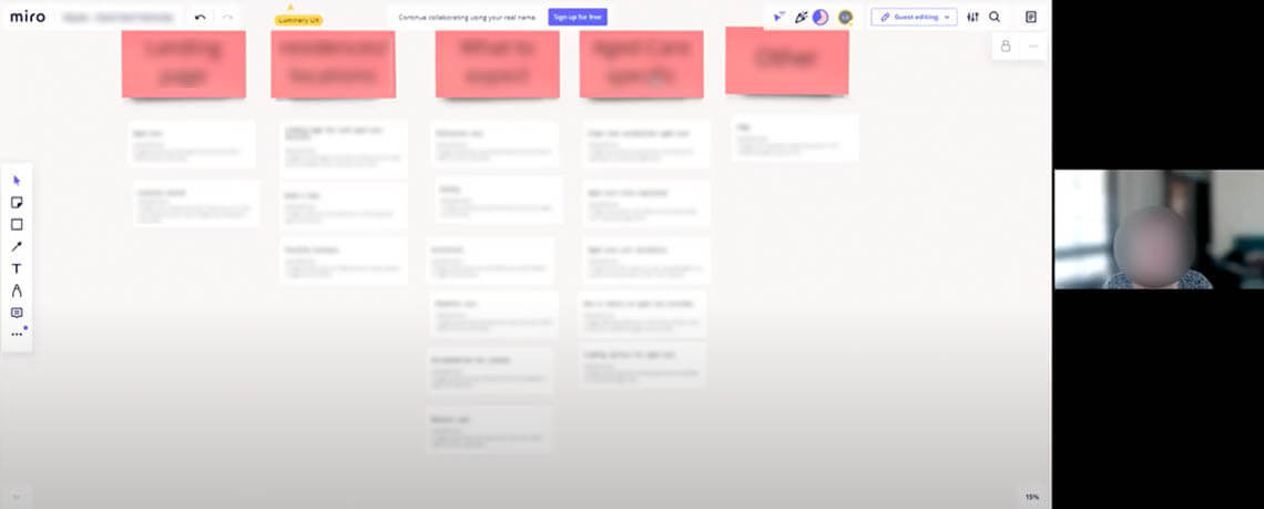
Card sorting activity
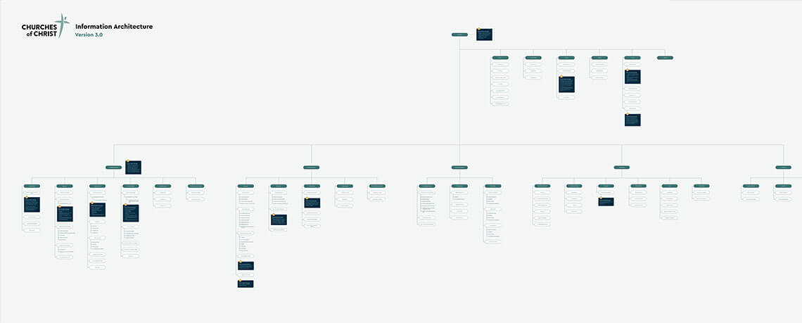
Information architecture
Prototyping and user testing
After the information architecture was refined, I wireframed and prototyped key pages of the website in Figma, which I then user tested with research participants to get feedback on functionality and usability.
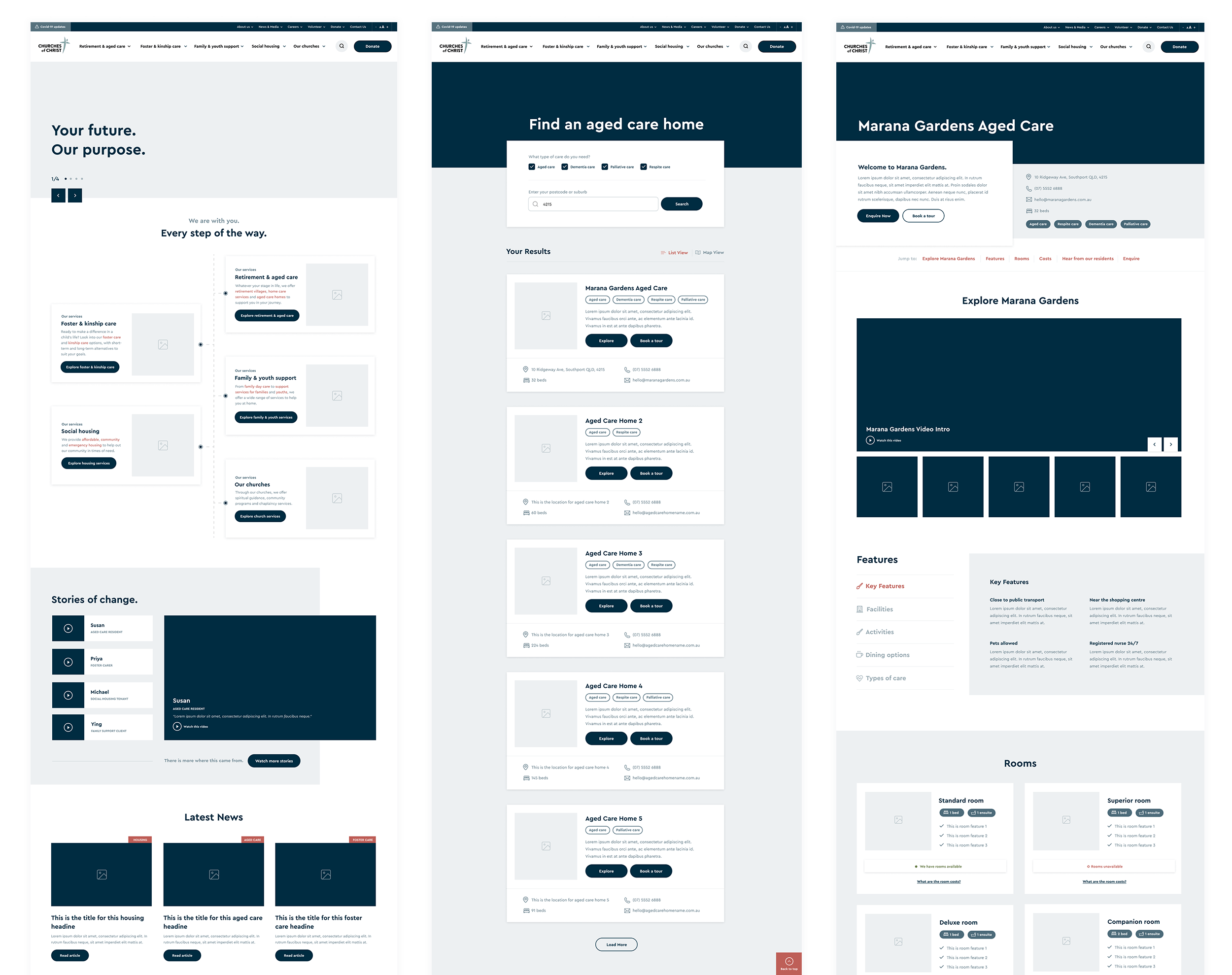
The final result
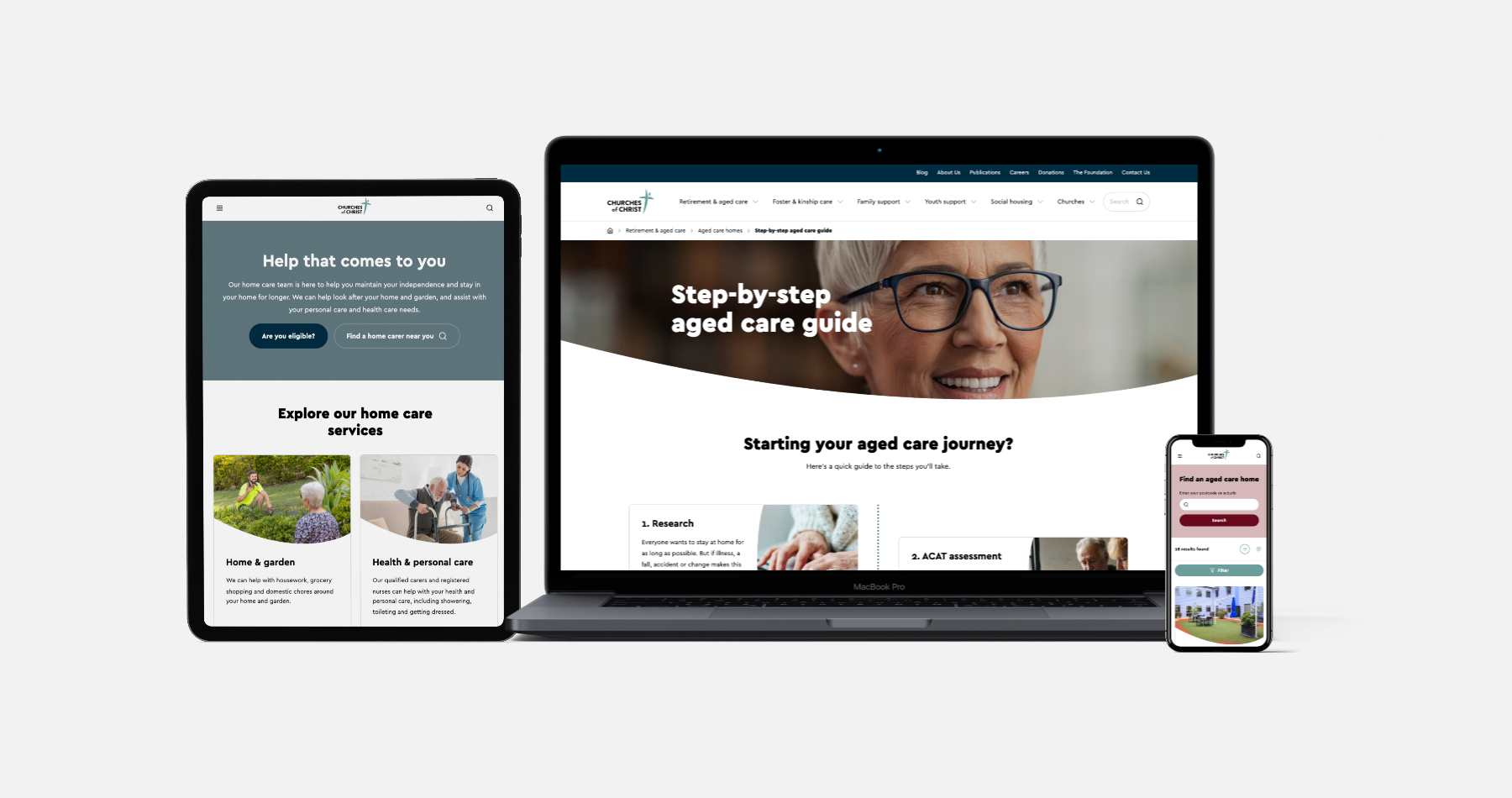
The final step was to hand over the wireframes to one of the visual designers who had been working on the new branding with Churches of Christ. The final website was launched in May 2022, offering clear information and support to anyone looking to start on their care journey, either for them or on behalf of a family member.
Key website features
1. Advanced search functionality to find service locations.
2. Landing page for each aged care home, retirement village, and care service with detailed videos, images and explanations of features.
3. Detailed step-by-step guides and resources for each type of care, including important links and emergency contact information.
4. Clear funding explanations, breakdown of costs and fee calculators.
5. Ability to book tours and appointments online.
6. Advanced donation form with ability to give one-off gifts and define which cause to contribute the money to.
Other Projects

Debenhams Australia AppUser Research, Product Strategy, Experience Design
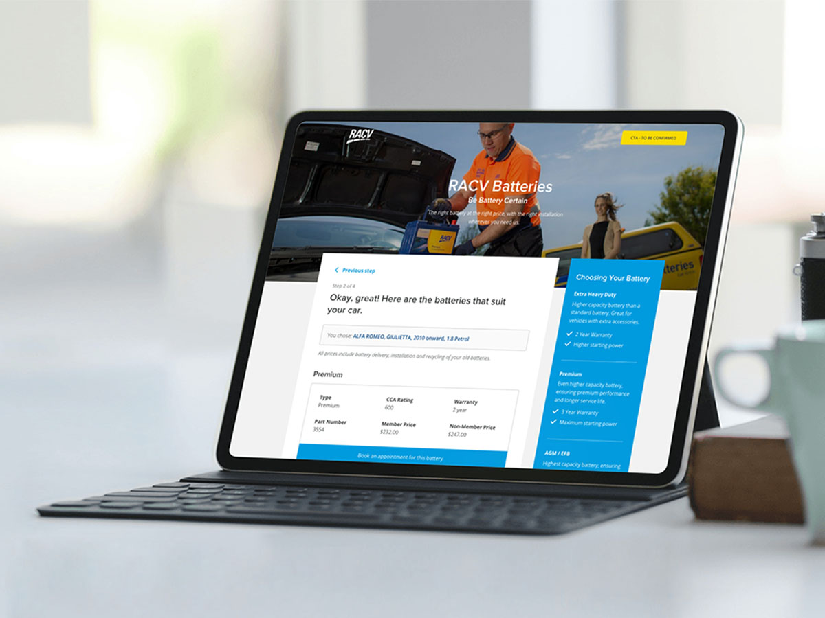
RACV Battery Booking SystemExperience Design, Visual Design
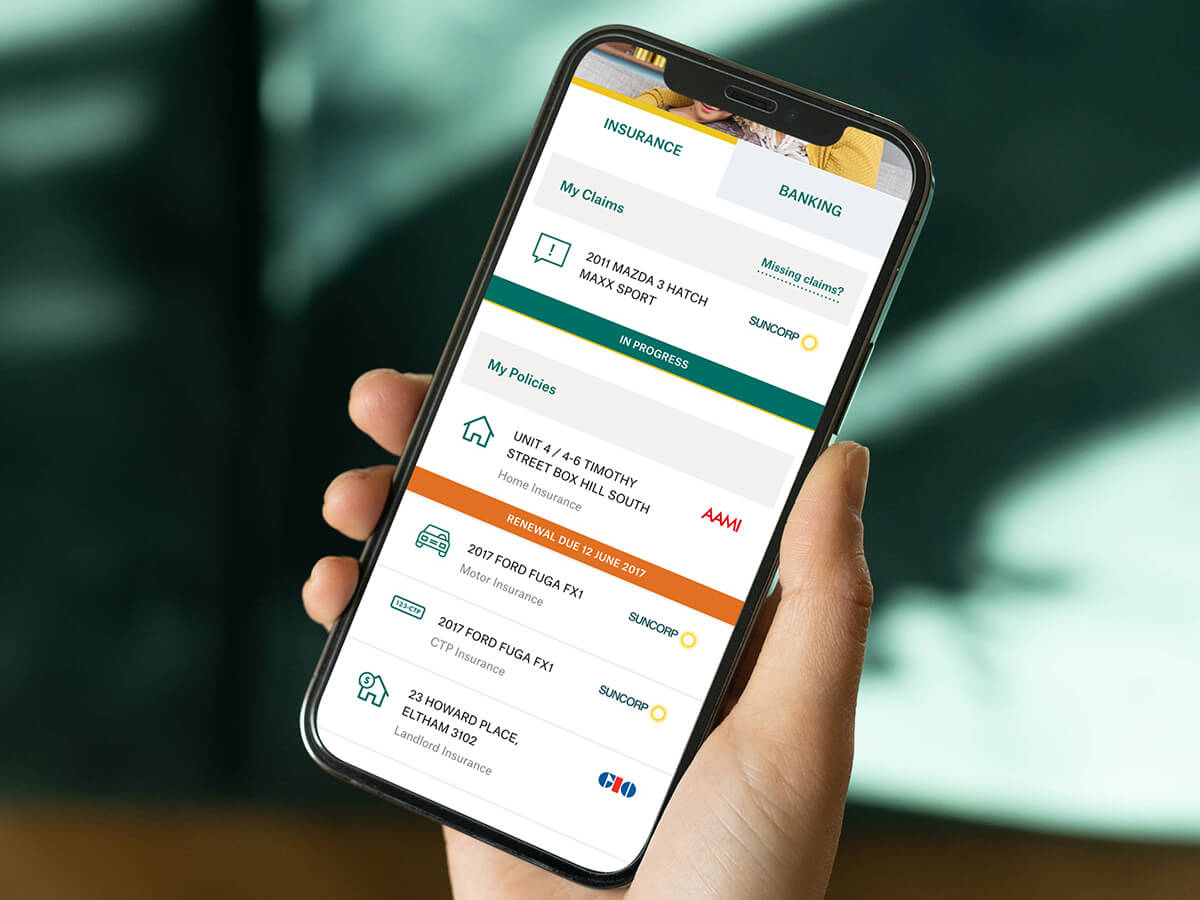
My SuncorpExperience Design, Visual Design
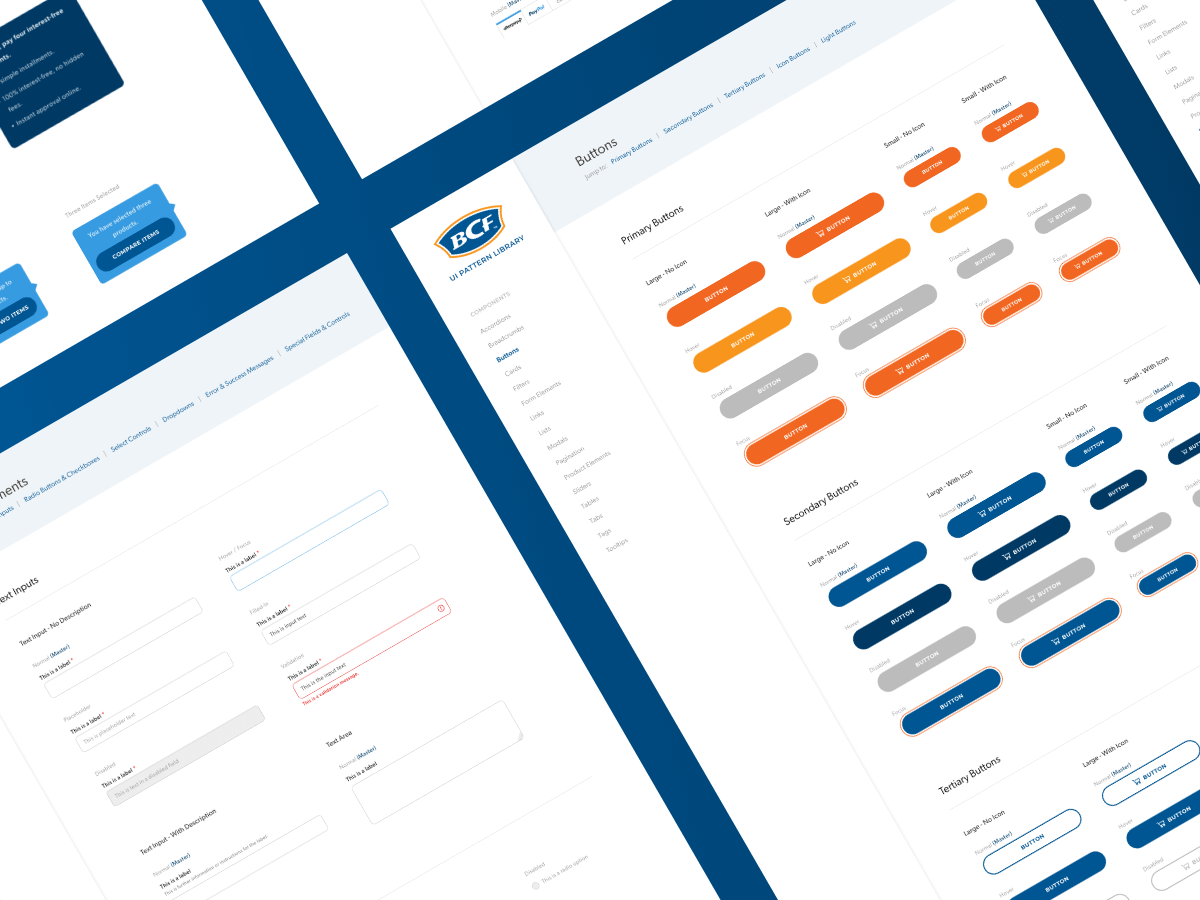
BCF Design SystemDesign Systems, Digital Accessibility, Visual Design

The Learning SpaceUser Research, Product Strategy, Experience Design

Interested in working together?
Let's grab a coffee (in person or via Zoom).
© Florencia Mostaccio 2022 - ABN 82 342 102 322
Based in Melbourne, Australia.