Innovating the shopping experience for a new department store.
Debenhams Australia
Introduction
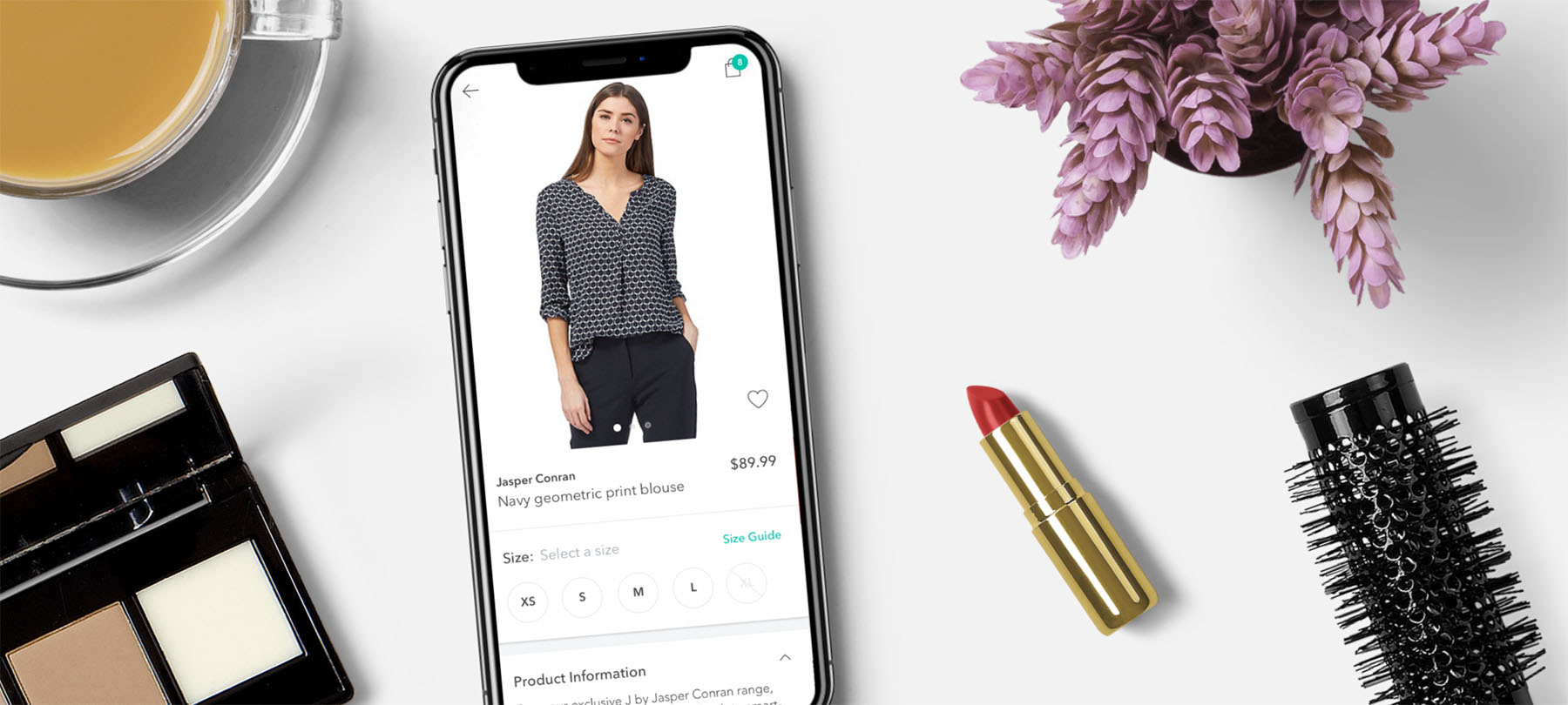
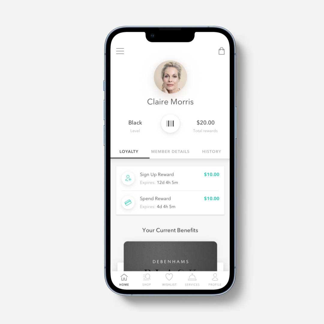
In September 2017, British retailer Debenhams launched its first store in Melbourne, Australia. As part of their digital strategy, they wanted to create a mobile application for their Australian market.
The goal was to make the mobile app a primary channel through which the customer would engage and interact with the Debenhams ecosystem, with a focus on a personalised and omni-channel experience.
My role was to lead user research and UX design efforts for this mobile app project, including overseeing the work of two other designers.
This project was completed while working at Arkade.
My role
User research
User flows
Information architecture
Wireframing & prototyping
User testing
Feature prioritisation
The research process
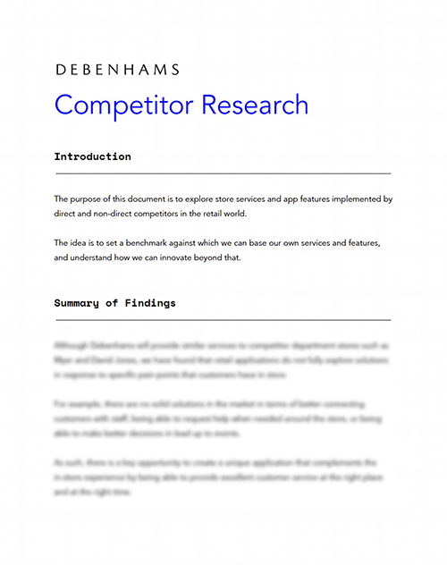
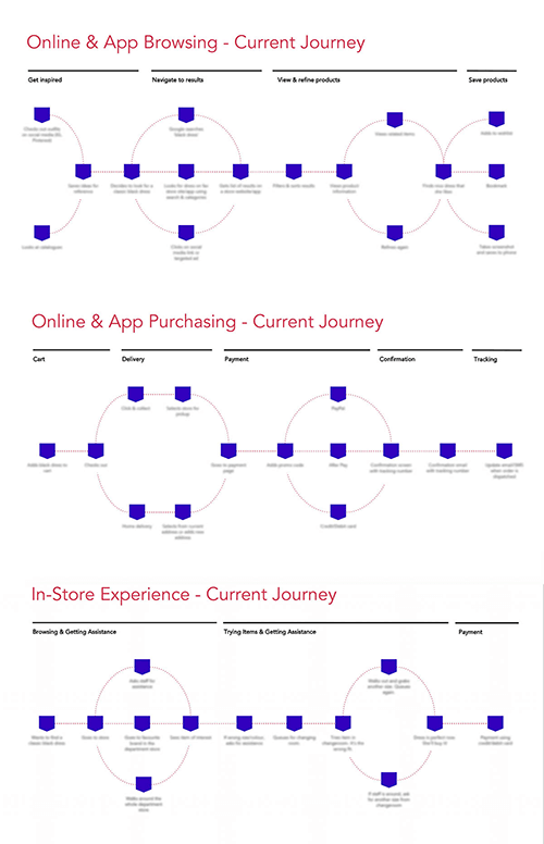
My main goal in the user research stage was to understand the areas of pain, need and delight across two areas of the customer shopping journey: online browsing & purchasing, as well as the in-store experience.
Understanding these aspects helped map the future-state journey of the Debenhams customer and prioritise mobile app features that would support the store’s omni-channel strategy.
Competitor analysis
Market research analysis
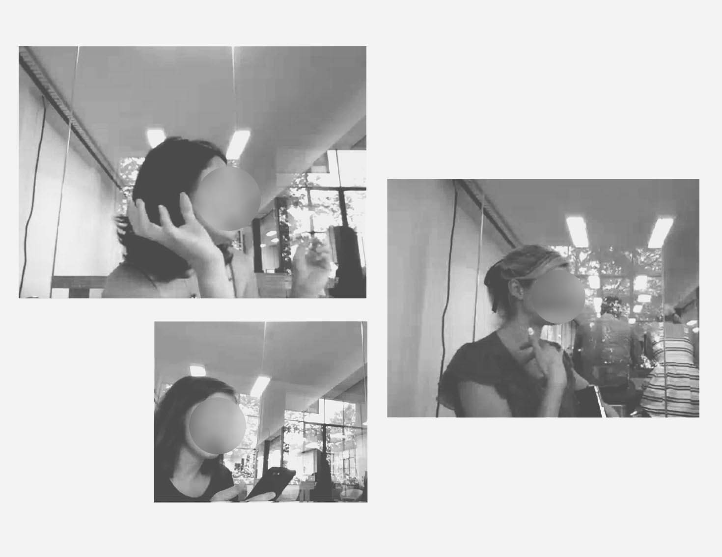
1-on-1 customer interviews
Card sorting
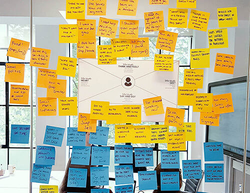
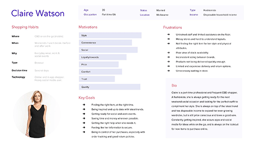
Empathy mapping and personas
Customer journey mapping
Research snapshots
Customer goals
The research identified detailed needs and delighters during the in-store and online shopping journey which translated into customer goals. Presented here is a broad summary of the categories under which these goals fell.
In-store goals
1. Getting the right type of assistance, at the right time.
2. Access to detailed product information and stock availability.
3. Booking beauty and personal shopper appointments.
4. Taking advantage of the loyalty program in-store.
Online goals
1. Seamless product browsing through intuitive filters and categories.
2. Flexible delivery options, transparent tracking, and easy returns.
3. Ability to curate lists of products (e.g. through wishlists).
4. Personalised recommendations, delivered at the right time.
Defining the Debenhams app
Based on the insights from the research, I organised a workshop to map and prioritise features for the Debenhams app that would provide the ultimate omni-channel experience.
01
Discover brands and seamlessly browse products.
02
Track orders and return items via the app.
03
Scan products in-store and check relevant information.
04
Book in-store beauty appointments.
05
Curate and manage wishlists and collections.
06
Track loyalty information and get exclusive benefits.
Mapping the structure
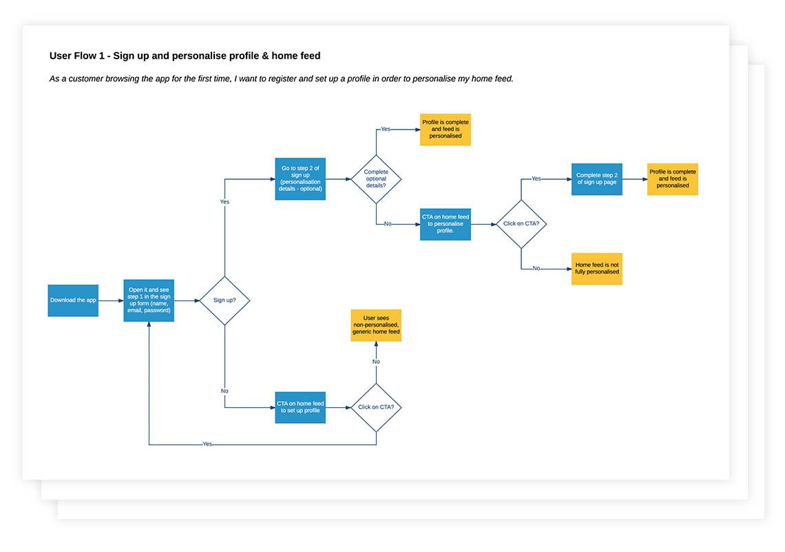
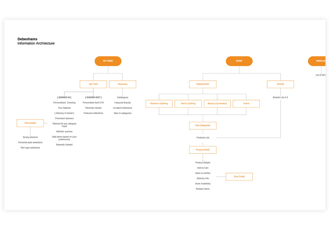
Based on the features defined in the workshop, I mapped the structure of the application through user flows and information architecture diagrams. A prioritisation activity ensured that the highest-value journeys were chosen in order to adhere to the tight project timeframe.
Validating concepts through user testing.
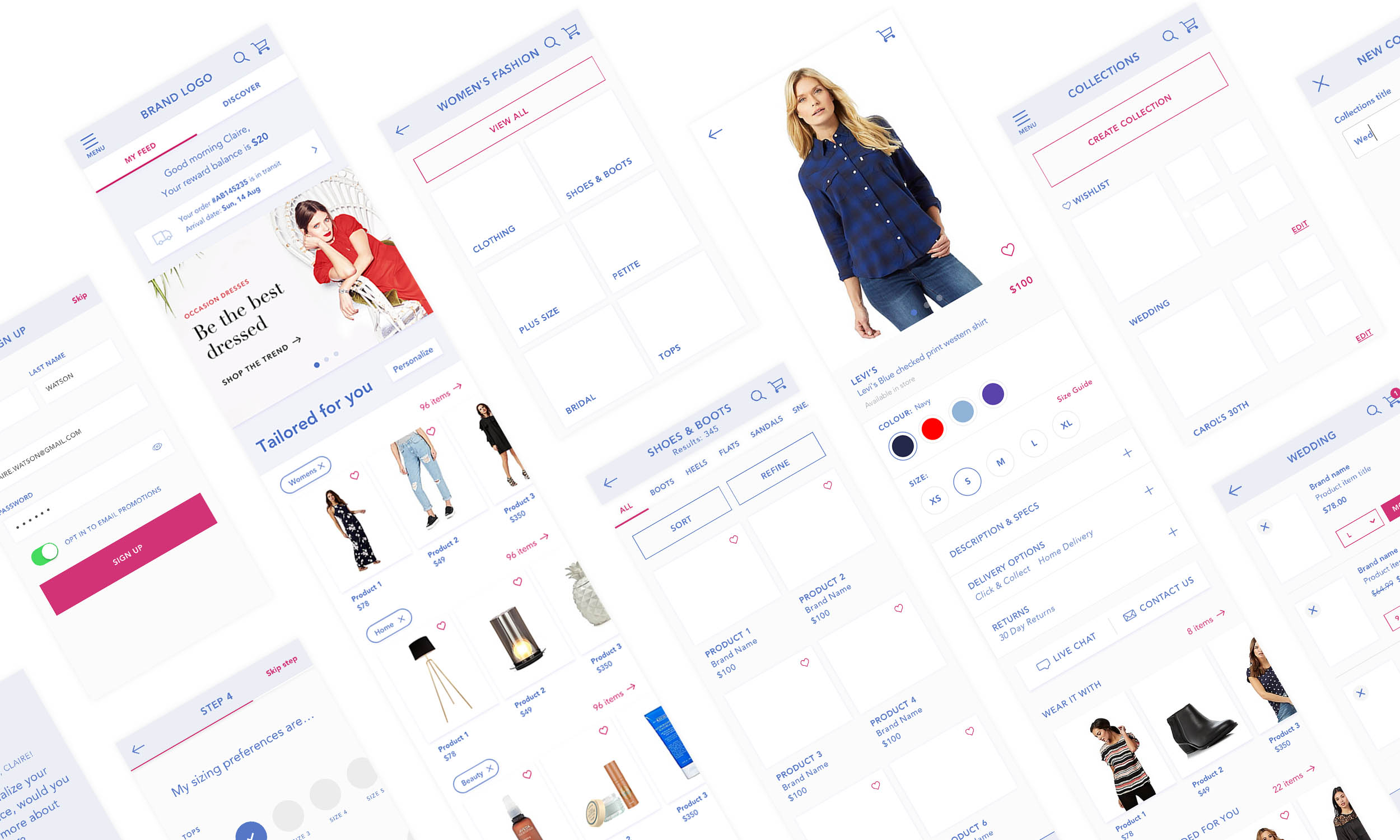
Based on the user flows and information architecture, key features were designed as wireframes and mid-fidelity prototypes, which I took through three rounds of usability testing in order to maximise usability and make sure that pain points were being solved correctly.
Features I wireframed include:
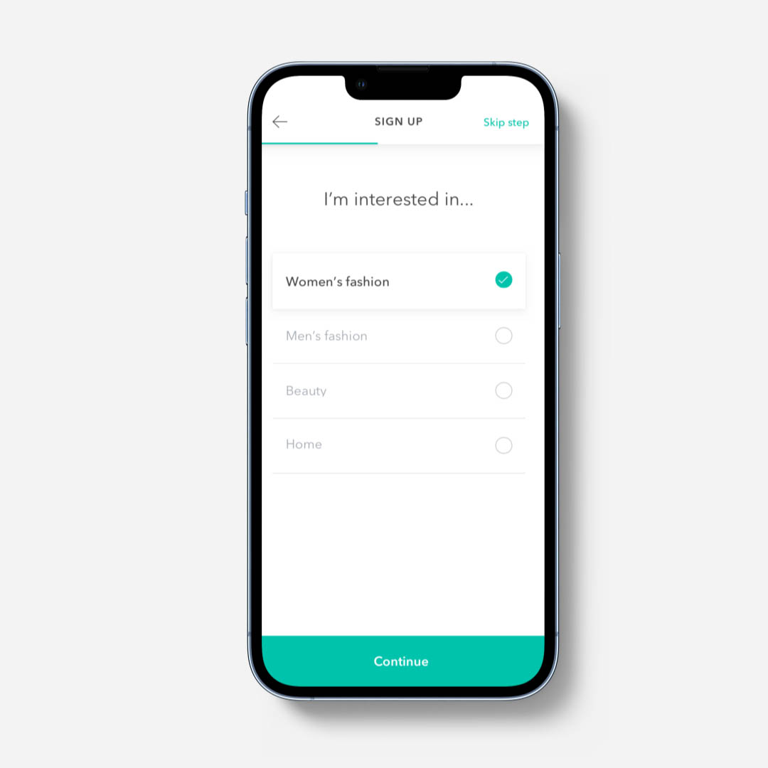
1. The sign up and onboarding process.
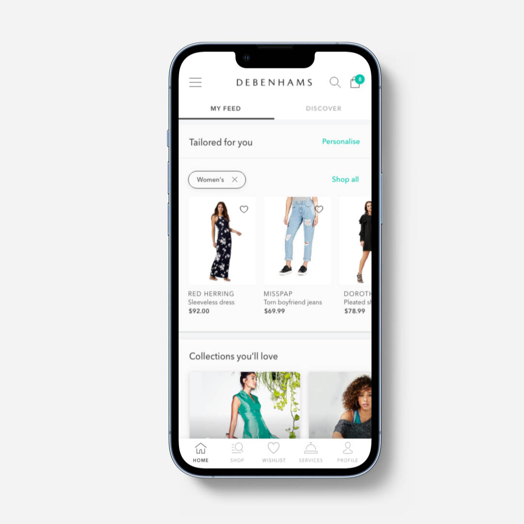
2. The home page.
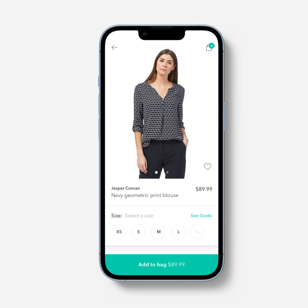
3. The category and product pages.
4. The wishlist and curated collections functionality.
5. The checkout experience.
The final result
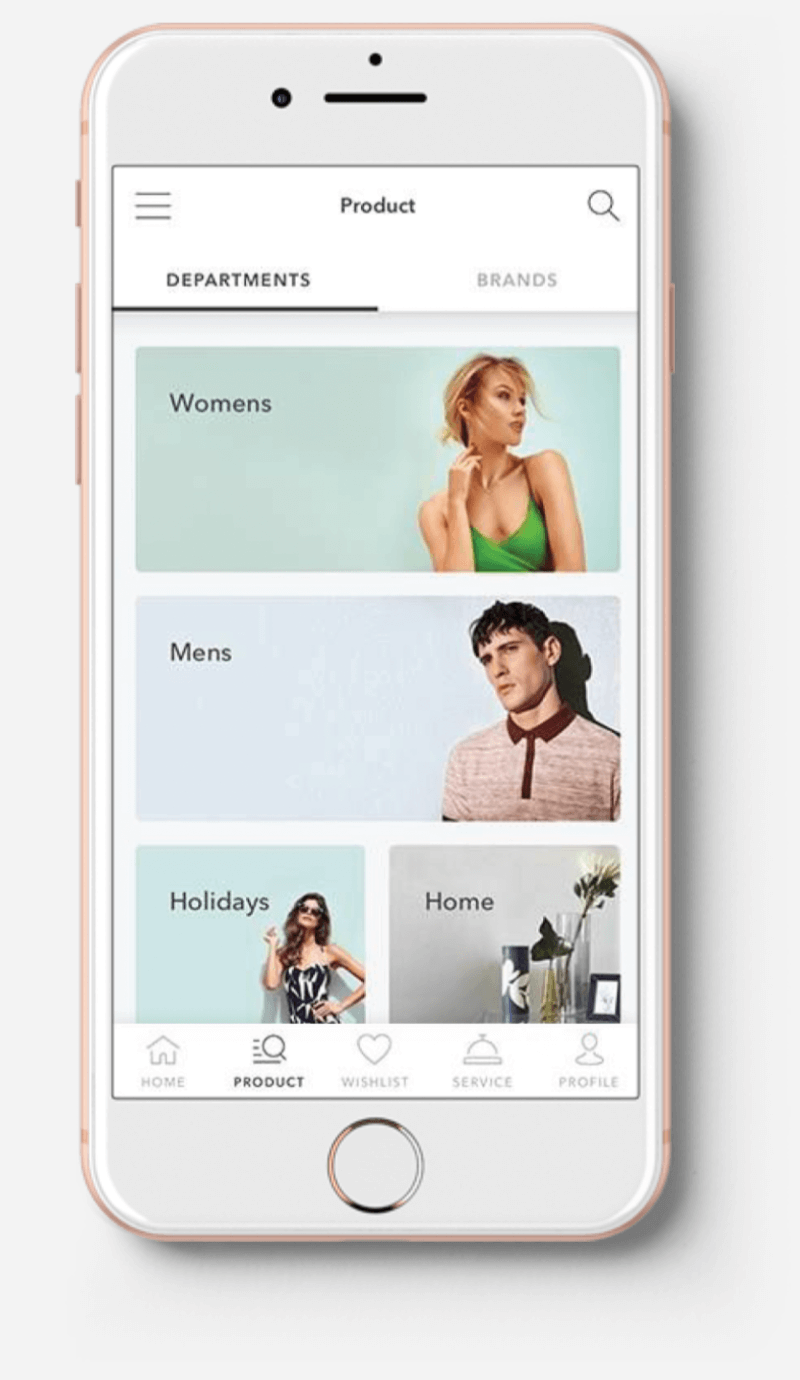
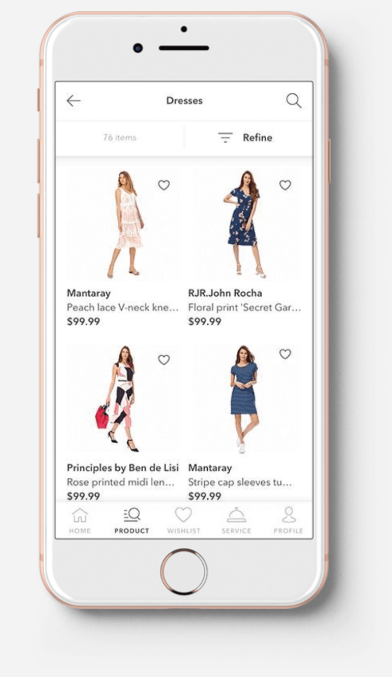
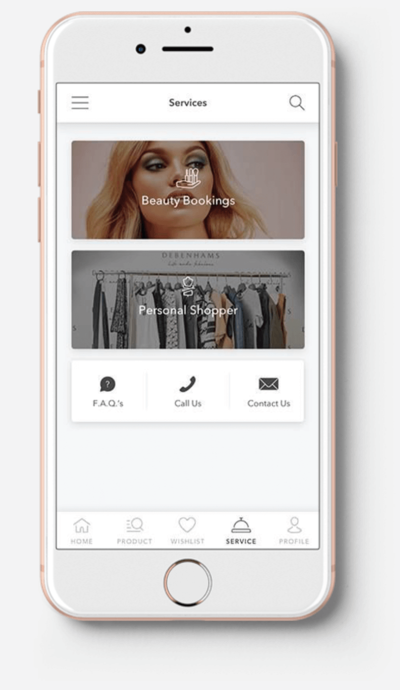
After the UI designer developed the styleguide, we added the new styles to the prototypes. Following this, I worked with project managers and developers to create a backlog of features, writing user stories and acceptance criteria. The final app was released in December 2017 and was very well-received, with an average 4.5 rating on both Android and iOS.
Other Projects
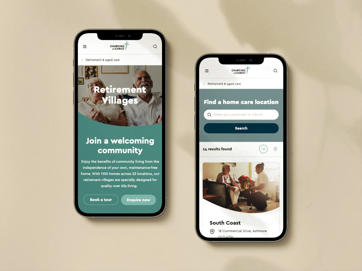
Churches of Christ WebsiteUser Research, Experience Design
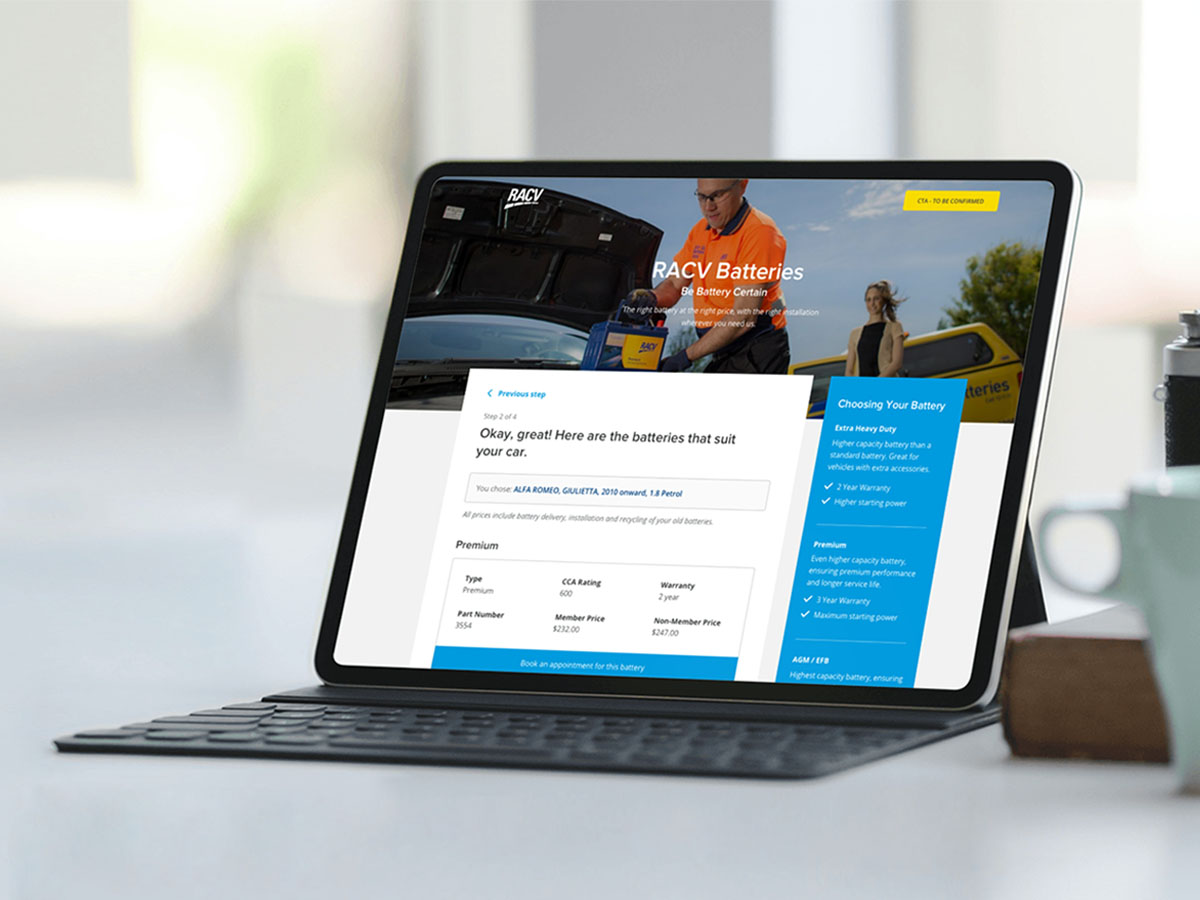
RACV Battery Booking SystemExperience Design, Visual Design
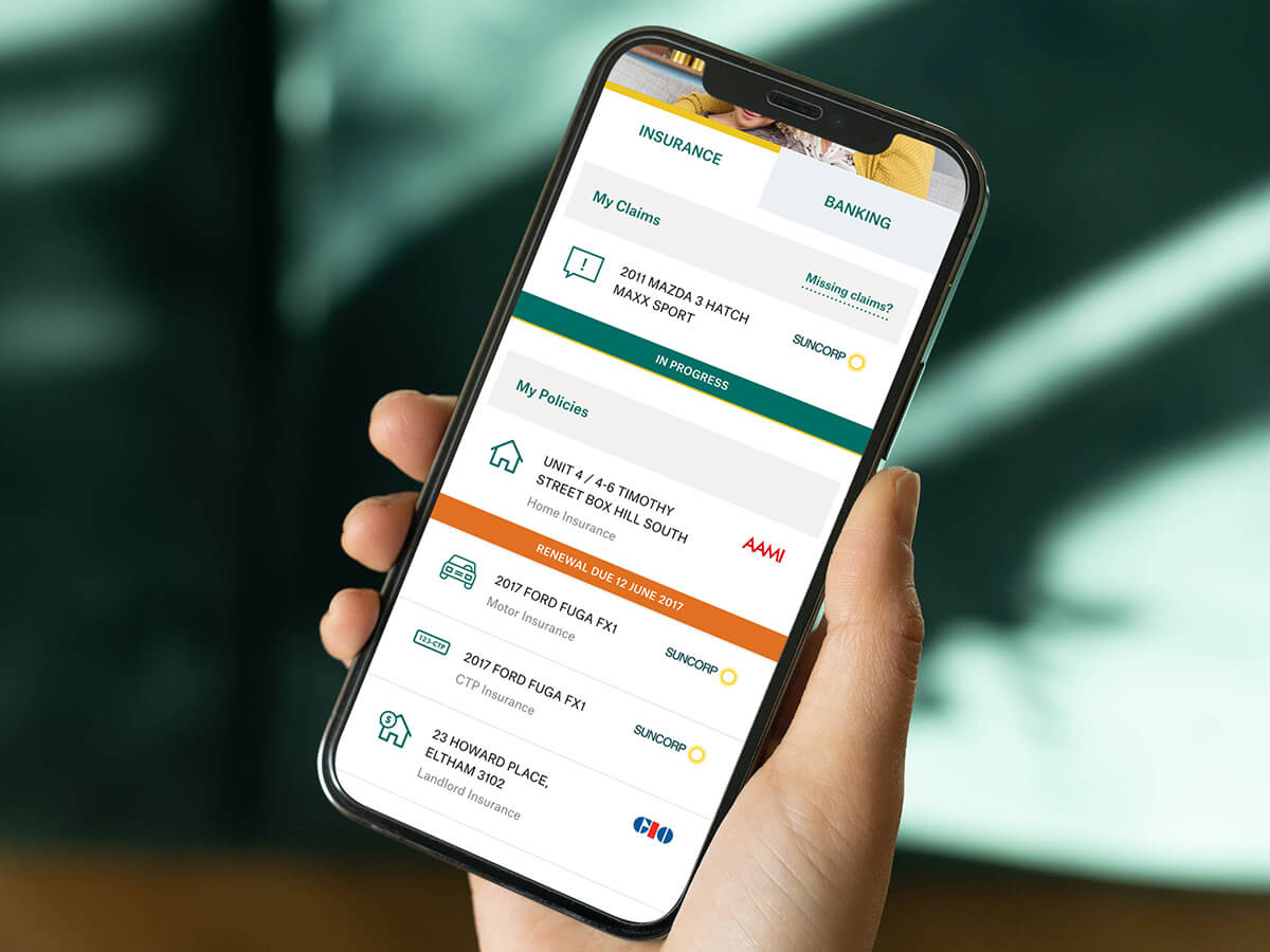
My SuncorpExperience Design, Visual Design
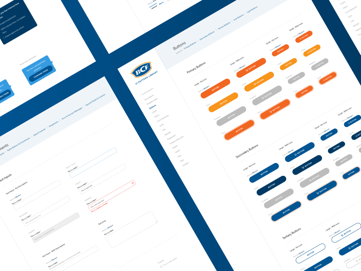
BCF Design SystemDesign Systems, Digital Accessibility, Visual Design
The Learning SpaceUser Research, Product Strategy, Experience Design

Interested in working together?
Let's grab a coffee (in person or via Zoom).
© Florencia Mostaccio 2022 - ABN 82 342 102 322
Based in Melbourne, Australia.